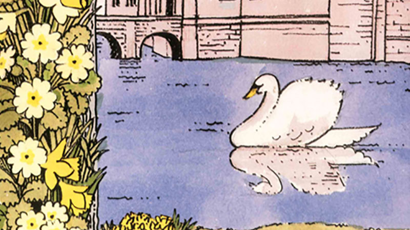
Pat designed over 300 tea towels for the Trust. This book is a record of that body of work, containing a selection of the designs that have given so much pleasure both to the members of the Trust and to their designer. Pat took her role seriously with missionary zeal! Every design merited a visit to the place to be depicted, whether in Cornwall, Northumberland or Norfolk… Often in the company of her long-time commissioning editor Ray Hallet, she would inspect the property, working out exactly what constituted, for her, the most characteristic aspects of the place. Perhaps it was this approach that made her own observations chime so clearly with that of the visitors for whom she was designing. The Reformation, the Civil War, the Grand “four or the Picturesque had little resonance for Pat, however, the Industrial Revolution and the Arts and Crafts movement meant rather more to a designer who came of age professionally in the post-Festival of Britain atmosphere of the 1950s when design seemed capable of changing the world.
Pat’s perception of pattern and color, her passion for gardens – more specifically for flowers – and her ability to see what was speaking to those who loved the places she illustrated made for a remarkable series of images. Briskly waving aside instructions from bristly, tweedy land agents or indeed former owners that “the house is seen at its best from the south-east”, Pat would assimilate details and elements that were seen as ancillary and unimportant to many but that proved to be just the telling detail that expressed the character of a place. Set-piece views of course made their appearances but their formality was frequently softened by a decorative border constructed of some more everyday or charming element: carrots, flower pots, or teaspoons. Amongst her most popular designs are those that step outside the property-specific: wildflowers, butterflies, even cats of the National Trust became bestsellers and, in due course, collector’s items.
Pat would begin with a rough design in miniature for discussion with what often became quite a team of clients but essentially these were to show to Hallet. He performed the essential role of any editor – questioning and challenging, even if the design was almost as desired. He was visually sophisticated and knowledgeable, and their conversation stimulated Pat to refine and complete the image. That relationship became one of the most important in her career (as well as an enduring friendship thriving till her death). Pats confident and unfailing line combined powerfully with her strict economy with color, the most elaborate of her designs relying on five colors and an outline, often using clever overprinting and combinations to give the impression of multi-colored naturalism. The plates shown here are a mixture of designs in gouache and felt pen on watercolor paper (Kent 90lb NOT) and those actually printed on linen or linen union.


